Tillman Crane / STRUCTURE
Four Images and one that should have been included
Tillman Crane/STRUCTURE was published 18 eighteen years ago this month. Books like John Sexton’s Quiet Lightand Bruce Barnbaum’s Visual Symphonyinspired me to think about creating my own book project. After producing a mock-up and finding a publisher we worked with the designer to sequence the project. My original title was Spirit of Structure, but the publisher felt a better title for a first book should focus more on my name. I sometimes still find myself wishing I had held my ground…
Structure was the acknowledgment that I was not a landscape photographer but a photographer of built places. I couldn’t photograph buildings like a traditional architectural photographer, but I could do it my way, with all the building’s faults and flaws, perfect in its imperfections.

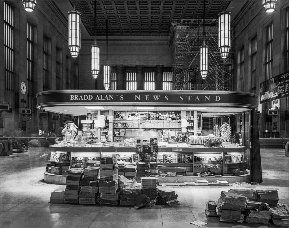
Bradd Alan’s News Standshould have been the cover image of the book. It was the image that started me down this path and remained one of my favorite photographs. It captures the apparent quiet in 30th Street Train Station, Philadelphia, PA at early morning rush hour. The prolonged exposure creates ghost images, and the news stand sits in the middle of the station like an alien spacecraft. It would have made a compelling cover image.

Barn in Snow is a homage to the practical structures that abound in rural Maine. It sits in its magnificence on a cold winter day.

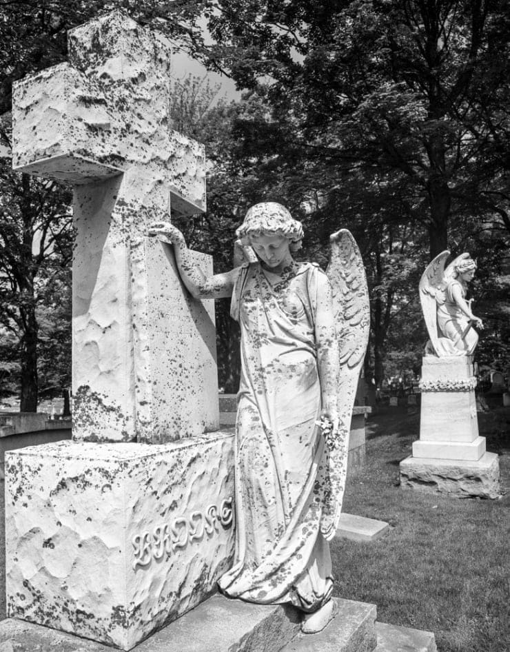
Belfast Angelis an example of a teaching image that turns out better than expected. I was teaching a large format view camera class, demonstrating the importance and use of front swing to get near and far in focus. It was just a demo image and when I looked at it a second and third time I realized that is was not only a good demo image, but a good image in and of itself.

Spiral Staircase, Portland City Hallwas the first image in my long series of staircase images. It was shot as part of a photo essay for Down East Magazine. It is simple yet appealing in its design. It was the image we choose to open the book.

Seven Statueswas the mock-up cover for Structure. I loved the image but the statues faced the wrong way, and I didn’t want to flip the negative to make them turn the right direction. Alas, it didn’t make the final cut for the book and has rarely been seen or exhibited. But it remains one of my favorite images.
tillman