Vantage Point
In 1966 John Szarkowski and the Museum of Modern Art in New York published a book called the Photographer’s Eye. In his introduction, Szarkowski wrote, “It is the thesis of this book that the study of the photographic form must consider the medium’s “fine art” tradition and it’s “functional” tradition as intimately interdependent aspects of a single history.”
I believe this is one of the best books on photographic vision or seeing as a photographer ever written. Szarkowski divides the photographic image into five components: the Thing Itself, the Detail, the Frame, Time and Vantage Point. Craig Stevens and Kate Carter took this book and these five components and created the Photographer’s Eye class at, what was then the Maine Photographic Workshops. I took the course early in my career and taught the class several times later while on the Resident Facility at Maine Photographic Workshops.
I would wager that the vast majority of photographs ever made were made looking at the world through a window approximately 4.5 feet to 6.5 feet off the ground. In short, eye level. It is the way we naturally see the world. Images made from other points of view immediately strike us as different or unusual. This is one reason drone photography is so popular. It shows us the world from a different vantage point, that of a bird’s eye view.
Where we place the camera impacts how the viewer sees our photograph as well. Putting a statue on a pedestal forces us to look up and makes the subject heroic. When we look at something “eye to eye” it infers an equal relationship. And when we look down at something it gives a sense of superiority. The vantage point from where we aim our lens tells the viewer how we think about the subject.
In preparing work for this years exhibition, I am considering two versions of an image.


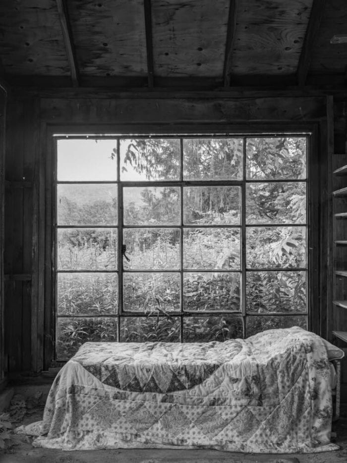
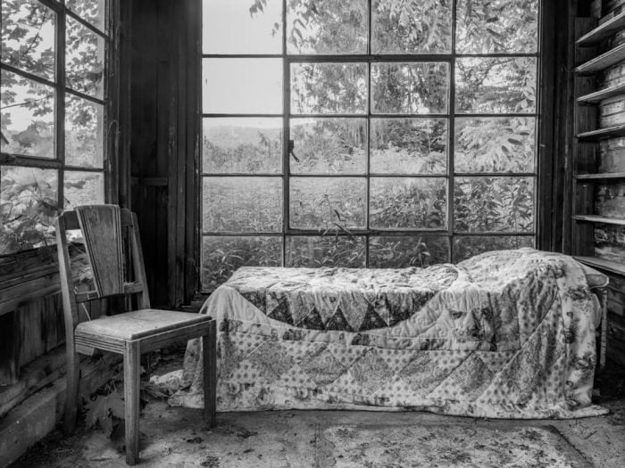
They were made at the same time, in the same location, with two minor differences in composition. One has a chair, and one does not. One is a vertical image and the other is a horizontal image. I moved the chair after I made the first image. And I thought that was the only difference. But the more I looked at the two pictures I realized they were very different, and they were changed because of the vantage point that I made each image from.
In the one with the chair, the camera is closer to the level of the chair and bed. It is as if the viewer has been invited into the room as an equal, invited to sit on the chair, to be a participant in whatever is about to happen in the location. There are windows seen behind and to the side of the chair and bed, but you don’t see the full window or any of the ceiling. It is a more comfortable image.
The second image, missing the chair, the camera was placed at a higher vantage point. We are coming into the room to observe, to check out, perhaps to judge. Who would be sleeping in a barn? The full window behind the bed is visible, the side window is not visible. The dark ceiling above creates an entirely different atmosphere for the photograph. The dark ceiling adds a sense of foreboding. It is a more judgmental image, less inviting.
I have printed both of them. One will hang in the house, and the other will hang in a new exhibition at Stanhope and Spencer Gallery, Rockland, ME. I don’t know which will go where. I like them both. Differing vantage points give them very different feelings.
Have a great Spring.
tillman